Beyond the Five Rings: Olympic Logos of the Past
Aug 12

Now that the Olympics are in full swing, and the logo created for the 2016 Rio Games is on TV, social media, and the news every hour of every day, I wanted to take a look at this logo and past logos of the Olympic Games.
An Olympic logo must do many things. It must be awe-inspiring; it must use motion, colors, and balance to best represent both the athleticism of the games and the culture of the host region and must be brand new every two years. Based on the media silence regarding this year’s logo for the games in Rio de Janeiro, Brazil, I’d say they did a good job attempting the impossible: pleasing the world. It’s apparent a lot of thought went into the execution. The inspiration of a local mountain range and use of a complementary font make it a pleasant visual experience.
Below is a brief look at which Olympic brands have been deemed successes and which have fallen short.
The Poorly Executed
1948, Switzerland

First and foremost, this isn’t really a logo. It’s more of a poster or flyer. Granted, the term “logo” had a different meaning in the 1940s, but there are plenty of attractive, punchy marks from that era. These classic marks show that the right mix of color, shapes, and lettering can make an attractive impression, regardless of age. Even though almost 70 years old, some of these look like they could still be found on packaging today.

It also doesn’t help that I couldn’t find a color version from the ’48 games in Switzerland, so I’m not sure if the lack of color is a statement of that time or due to an ink shortage, or if it was a creative choice. On a positive note, I do like the graphic nature of the rays emanating from the sun icon. Otherwise, it’s pretty forgettable.
1960, Rome

Twelve years later, the Romans were more successful creating a logo “feel” than the Switzerland games, but only in the broad definition. Another greyscale rendition that fails to make me feel inspired or remind me of the athleticism displayed at the games. I have seen a colorized version, but it somehow looks worse. I appreciate the nod to the foundation of the city, the short version of which goes like this: twins Romulus and Remus were saved by a she-wolf, who cared for them until a herdsman found and raised them. And, voilà, Rome. Great story. Bad logo.
2012, London

Now, a big jump forward to 2012 in London. This is the mark that comes up most when referencing bad Olympic visuals. Few logos have been more polarizing with such a broad audience. It was far too abstract for the taste of a million detractors. It (very roughly) spells out ‘2012’, but beyond that, it doesn’t seem to represent anything. To its credit, the governing body stuck to its guns, powered through, and developed a holistic strategy that enveloped the games, as well as the city. High marks for backstory and reason; low marks for the final product.
The Well-Done
1998, Nagano

This logo from the 1998 games checked all the boxes for a good logo that really explains the Olympics: vibrant colors, fluid lines, and a nod to the beautiful flora and fauna of Japan. Hidden within the snow flower are semi-abstract, flowing athletes. Everything fits together nicely, including the typography, which is a refined sans serif that is graceful, yet powerful – befitting a proud nation.
2002, Salt Lake City

Like Nagano, Salt Lake City’s Olympic logo is a well-balanced mark, strong enough to stand on its own. The snowflake uses robust colors found in the American west and stylistically manages to represent a rising sun behind a snowy peak. I somehow want this stitched on the back of my denim bomber jacket.
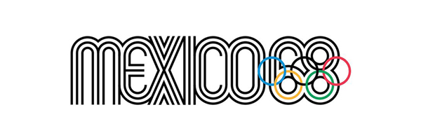
1968, Mexico

This is my personal favorite of the Olympic logos – even though it doesn’t overtly represent athletics the way others have. What I find most appealing is the way it captures the vibrant, visual style of 1960s op-art (for that it gets a pass on the lack of colors). Even without the date cleverly or blatantly incorporated, one could make a pretty good guess when these games were held.
The Never-Was
2020, Tokyo

In 2015, we were introduced to the summer games’ logo for the 2020 summer games, which was designed by a Tokyo-born designer. Not long after, a Belgian designer claimed the design plagiarized a logo he had created four years prior. In graphic design, it’s tough to stake a claim on shapes and colors, and really tough to prove the accusation. Looking at the two side-by-side, however, reinforces the Olympic Committee’s decision to start over.
Every four years, I look forward to seeing the new Olympic logo, and although many of the logos to a great job and representing its respective country, a handful just haven’t been up to par. The lack of loud feedback on the Rio logo, which is neither good nor bad, but from a designer’s perspective, not having people publicly loathe the work is kind of nice.
What has been your favorite Olympic logo?
